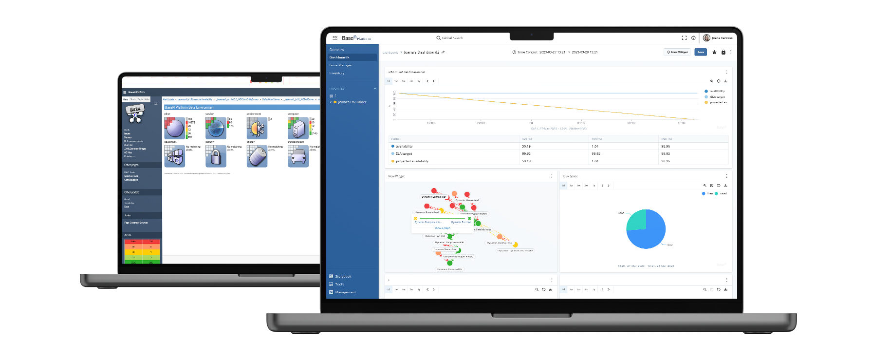
BaseN IoT Platform

Data Analysis and Visualization

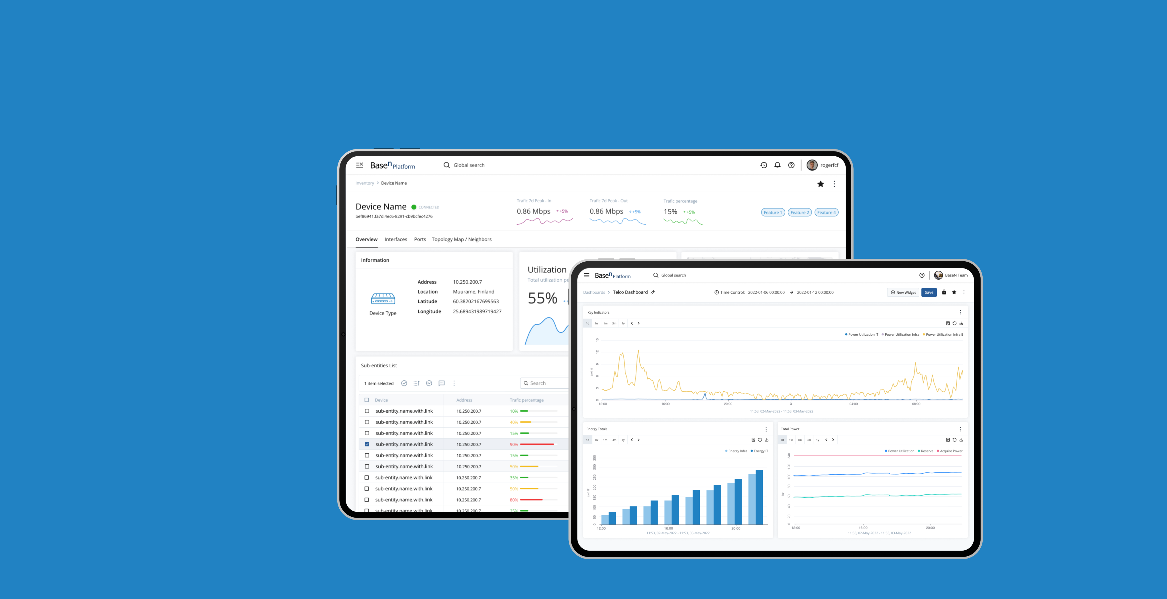
Better performance and a modern well-tried design experience on the same solid, resilient, and secure BaseN Platform ground.

Role & Responsibilities
Research, UI Design, Testing, Prototyping Creating a Design System Co-ordinating with Developers and PM
Team 
1 Product Designer
2 Front-end developers
1 Product Manager
3 Back-end Developers
Tools
Figma, Miro, Adobe Illustrator, Notion, Jira
Year
2021-2023

OVERVIEW

What is BaseN?

BaseN is a mature Software as a Service (SaaS) and Platform as a Service (PaaS) provider, launched and in continuous development since December 2001, providing an extremely scalable, fully distributed, resilient, secure, and combined real-time monitoring and control platform for ICT, M2M, and IoT combined.

BaseN provides new ways to capture, store, process, analyze, visualize, and control extreme volumes of things and data in real-time, which enables next-generation digital businesses to greatly improve what they do and how they do it.

THE PROBLEM

a little back story…
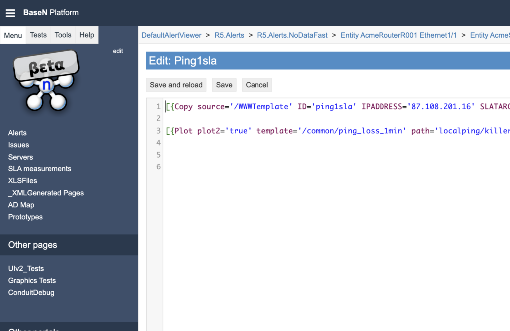
BaseN platform is a mature Platform as a Service in continuous development since 2001, it is more than 20 years of code and user experience decisions only with the development team. In 2020 Basen decide to invest in the user experience and bring a new life to this powerful platform.
THE PROBLEM
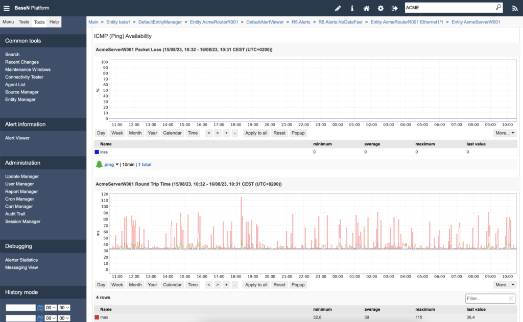
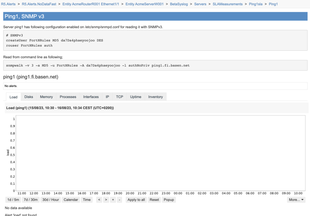
The old web publish BaseN platform was like giving users a playground of infinite options without any guidance. After a few years it turned into a support madness and  the data visualization side was hidden in the middle of millions of manually created pages.
❌ What is not working?

Too much flexibility. Too many features. Too much data to analyze with a poor user experience and guidance.
THE GOAL
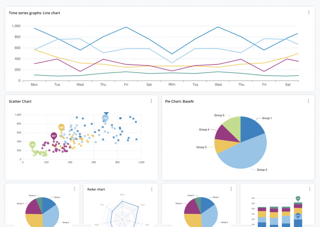
Data visualization plays a critical role in ensuring the efficiency of BaseN customers’ daily platform tasks. We sized up the challenges and opportunities in our current UI and decided to up our game, cooking up a fresh and sleek user experience on the same rock-solid BaseN Platform foundation.
💫 What could be enhanced?
Prioritize what is necessary for the customer’s ideal daily tasks. Give users more focus over their time.

OPORTUNITY

Improve performance and create a modern well-tried design experience on the same solid BaseN Platform ground

RESEARCH

Looking for opportunities

competitor analysis

This step was a crucial, helping us navigate the market and pinpoint where we could truly shine for both our existing and future clients.

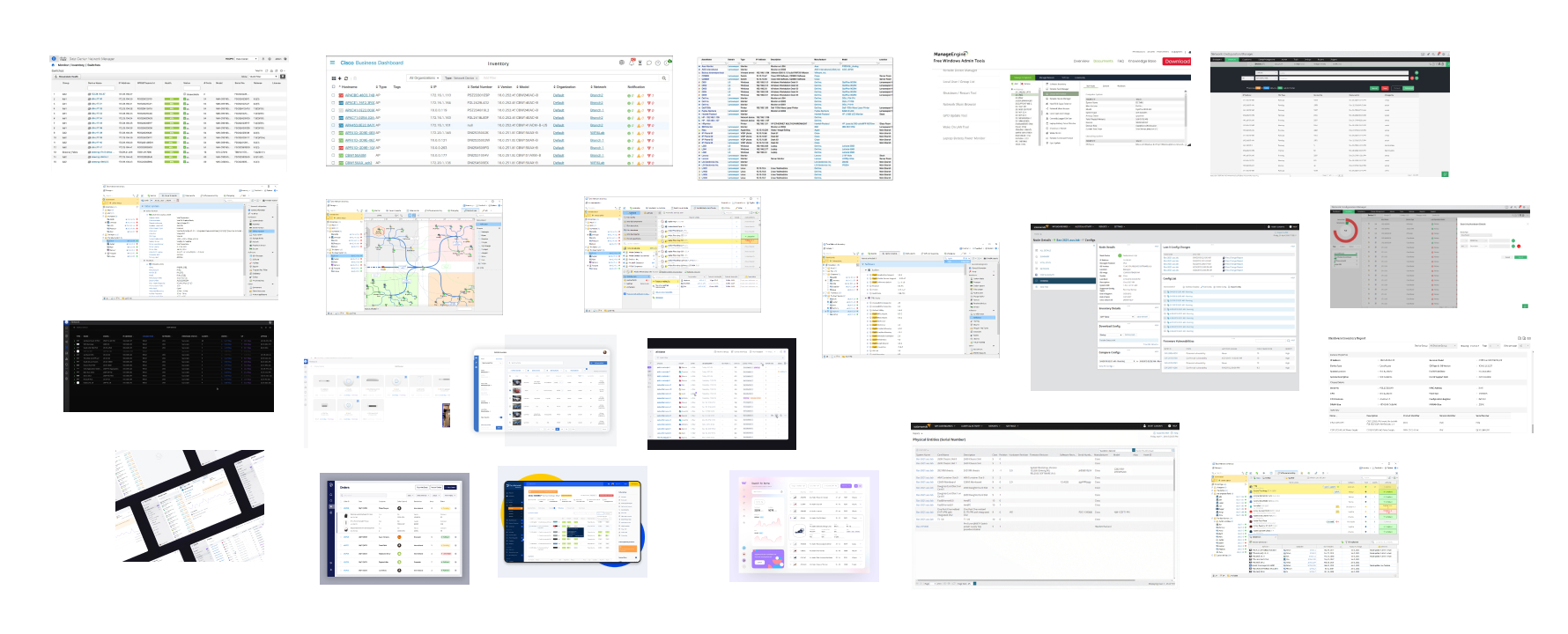
Time to dive into some competitor analysis! Looked at 8+ competitors across the world, and I noted down patterns and observations of what I found useful, interesting, or unique. Most of the competitors focused more on functionality over design aesthetics or user experience. I found a profound lack of good user experience especially on network configuration features. Even the big players lacked a lot of good design practices.
Qualitative research

user interviews

Engaging with current users through interviews revealed platform pain points, including confusion-causing features and performance issues.
In interviews with three diverse daily BaseN platform users, each about four persons, we discovered time-consuming pain points and gained broader insights. A clear pattern emerged: certain features caused confusion, demanding clarity. Surprisingly, we also found that users avoided direct coding in the platform due to performance concerns. Here’s a snapshot of the most prevalent feedback from these conversations.
“Too many clicks”
“Code outside of the platform”
“We didn’t know that feature”

CONSISTENCY

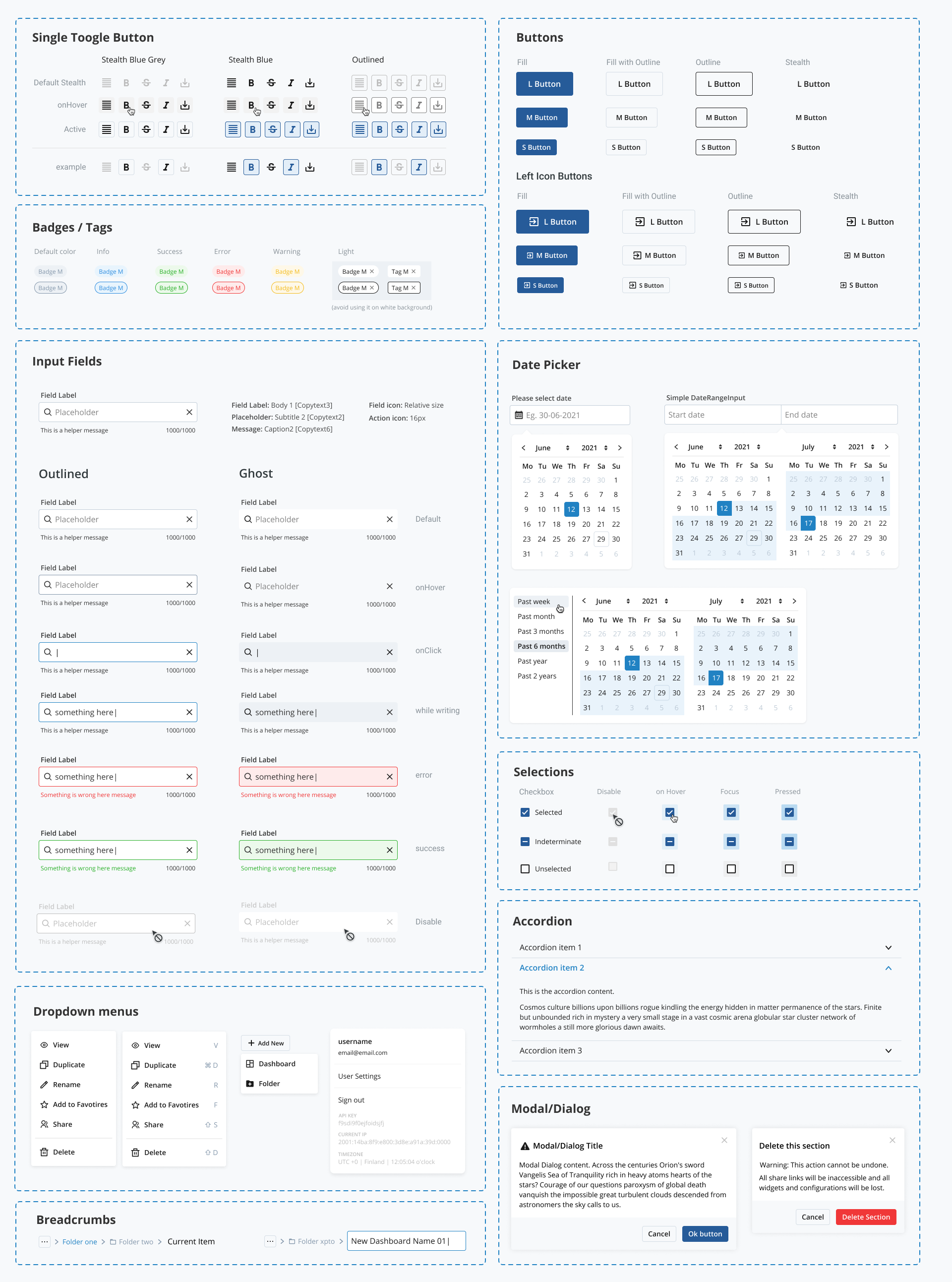
Building a robust Design System

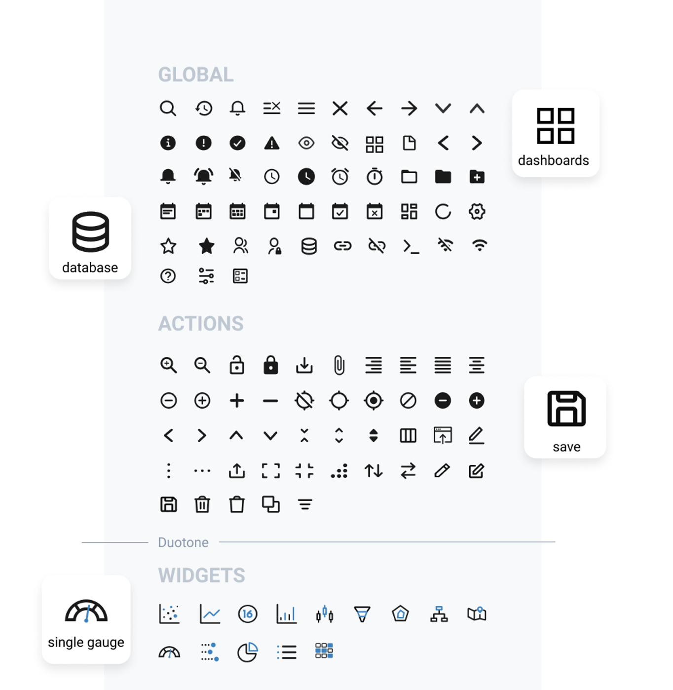
I built BaseN’s design system from scratch with the goal of enhancing the existing style across both brand and platform, while also elevating it into a robust and scalable system.

USE CASE

Lets dive into Dashboards

Getting clear insights from your data
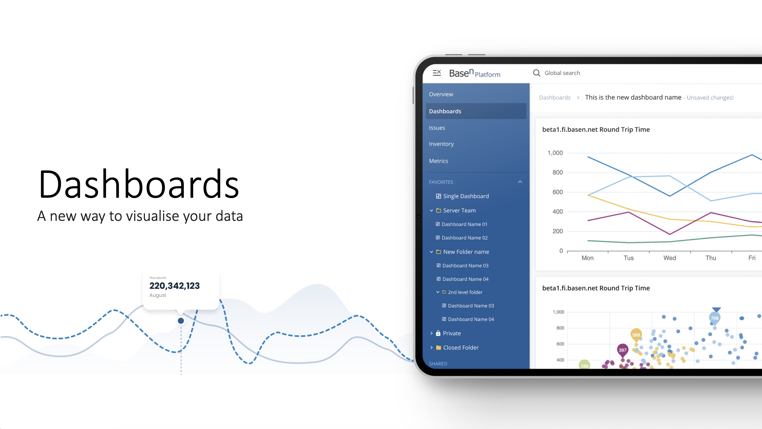
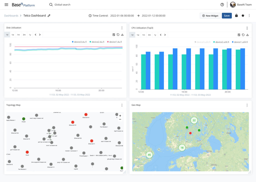
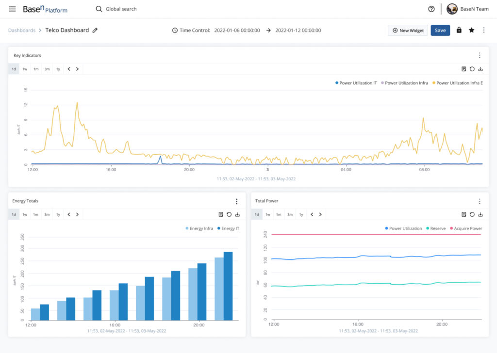
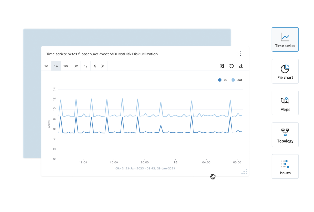
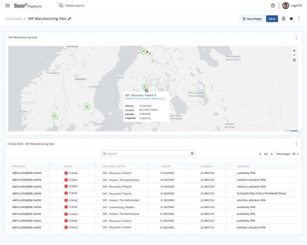
BaseN provides new ways to capture, store, process, analyze, visualize, and control extreme volumes of things and data in real time. Dashboards are the main new feature integrated into this new UI, how individuals visualize their data holds immense importance in ensuring accurate responses for mission-critical scenarios.

OLD PLATFORM PAIN POINTS

Outdated look with poor usability
Weak element hierarchy
Displayed UI elements aren’t customized

IDEATION

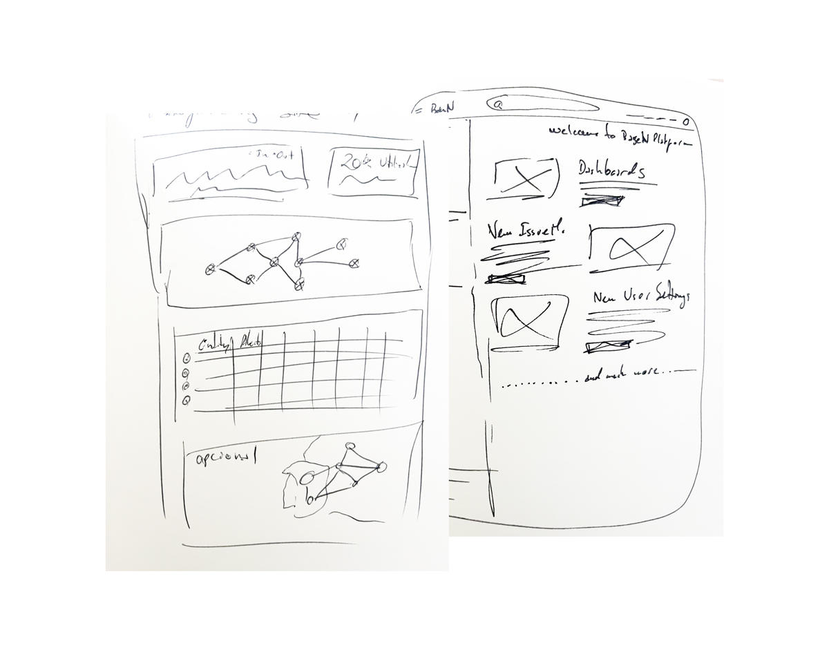
Paper explorations

My ideation process invariably commences with pen and paper, where I allow my ideas to flow freely at their own rhythm without caring too much about how it looks.

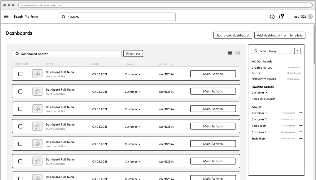
Wireframes

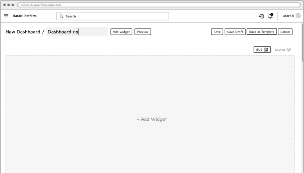
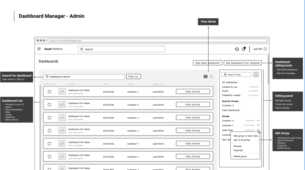
Transitioning from paper to Figma, I transformed my initial ideas into low-fidelity wireframes. These wireframes had reached a level of definition that allowed me to gather valuable user feedback at an early stage.

TESTING AND INTERATIONS

Feedback

sessions with users
We engaged in 3 separate sessions with different users, of different industries, to comprehend how our solution would assist them in analyzing and accessing necessary data. These sessions yielded three key insights that played a pivotal role in enhancing our solution.

Dashboard Manager should be simple and straight to the point. Main point is to create a dashboard fast, not managing folders and files.
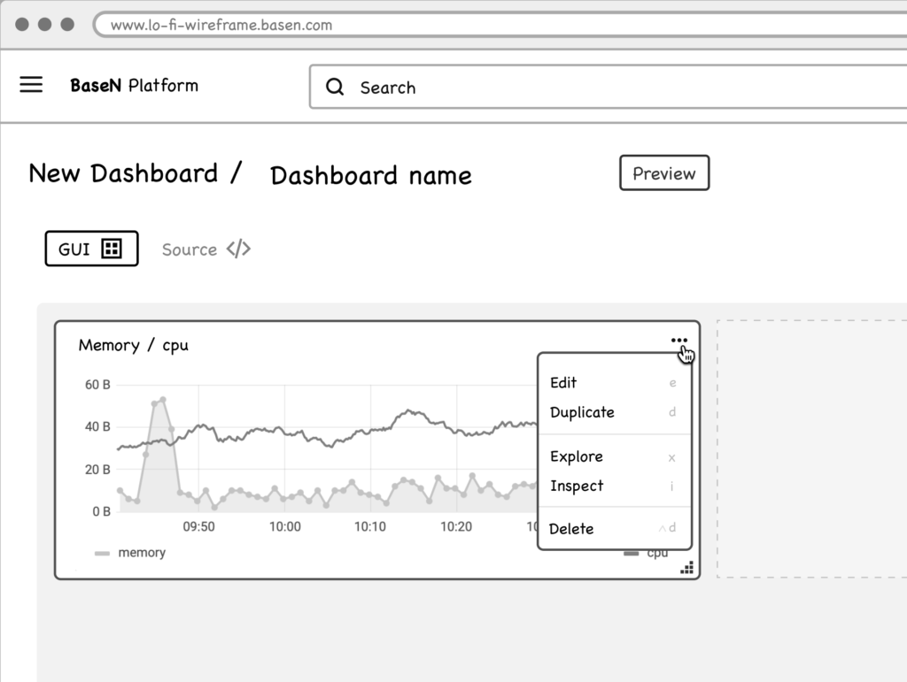
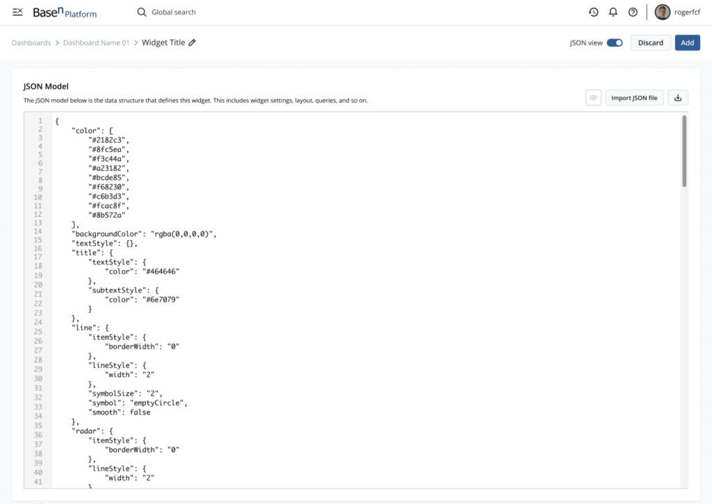
Even if all the options are available throught the GUI users want to be able to edit it by code as secondary option.
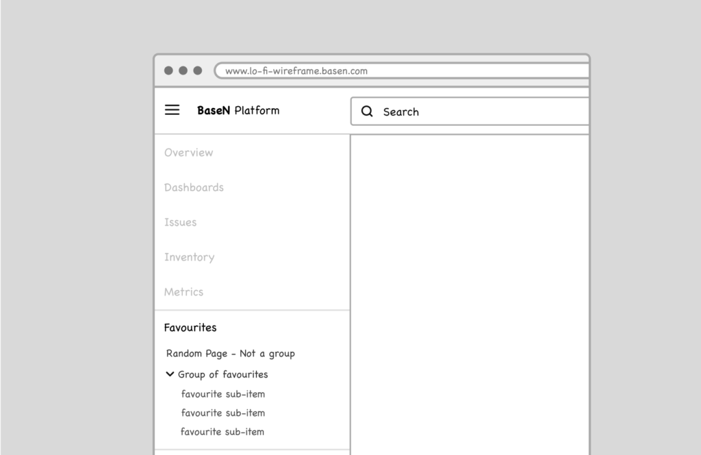
Instant access to critical dashboards is imperative, and the desire for a Favorites feature was expressed multiple times.

Interations

By integrating the feedback I received, I enhanced the design and constructed a fully interactive prototype. This stage heavily relied on the utilization of auto Layout, interactive components and component properties that were already established in the design system.

Usability testing

findings and iterations
I conducted a small usability test with 4 individuals. I was looking to test clarity, completion and comprehension of the different features.
BEFORE

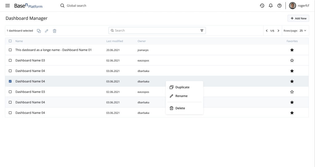
The first concept of the Dashboard Manager had way too many features that weren’t interesting for the user. 
AFTER
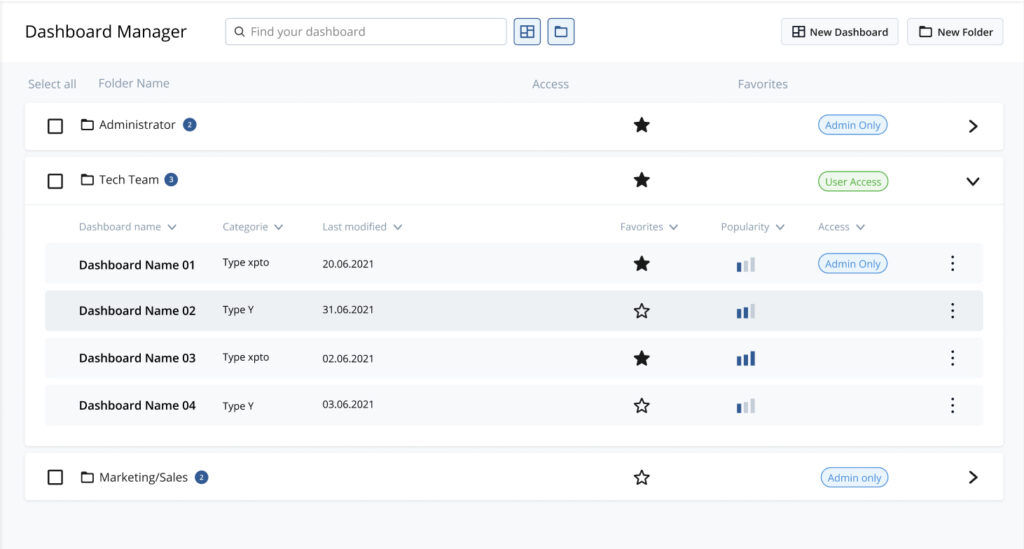
A simple version of the Dashboard Manager allow user to see all the dashboards, filter per their own and per favorites. This one level simple list is easy to access and doesn’t distract the user of the main point, make a nice and useful dashboard.
BEFORE
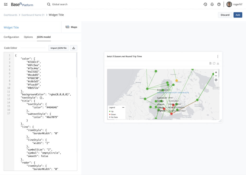
Users want real-time visibility into their code modifications, making a secondary JSON editor is preferable than a full-screen one.
AFTER
To address this, I have included the JSON editor into the edit widgets panel. This way users can see their changes while coding.
BEFORE

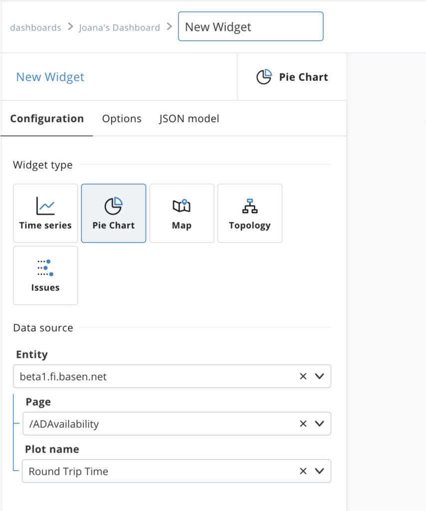
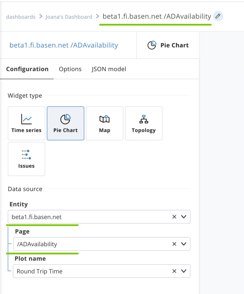
Widget name by user input was annoying and users left all the widget with the default name.
AFTER

To address this I include automatic widget naming, using the users selected data information.
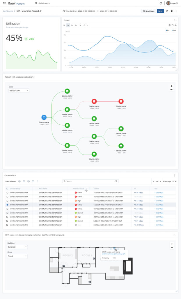
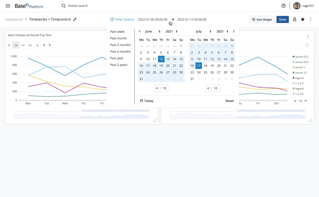
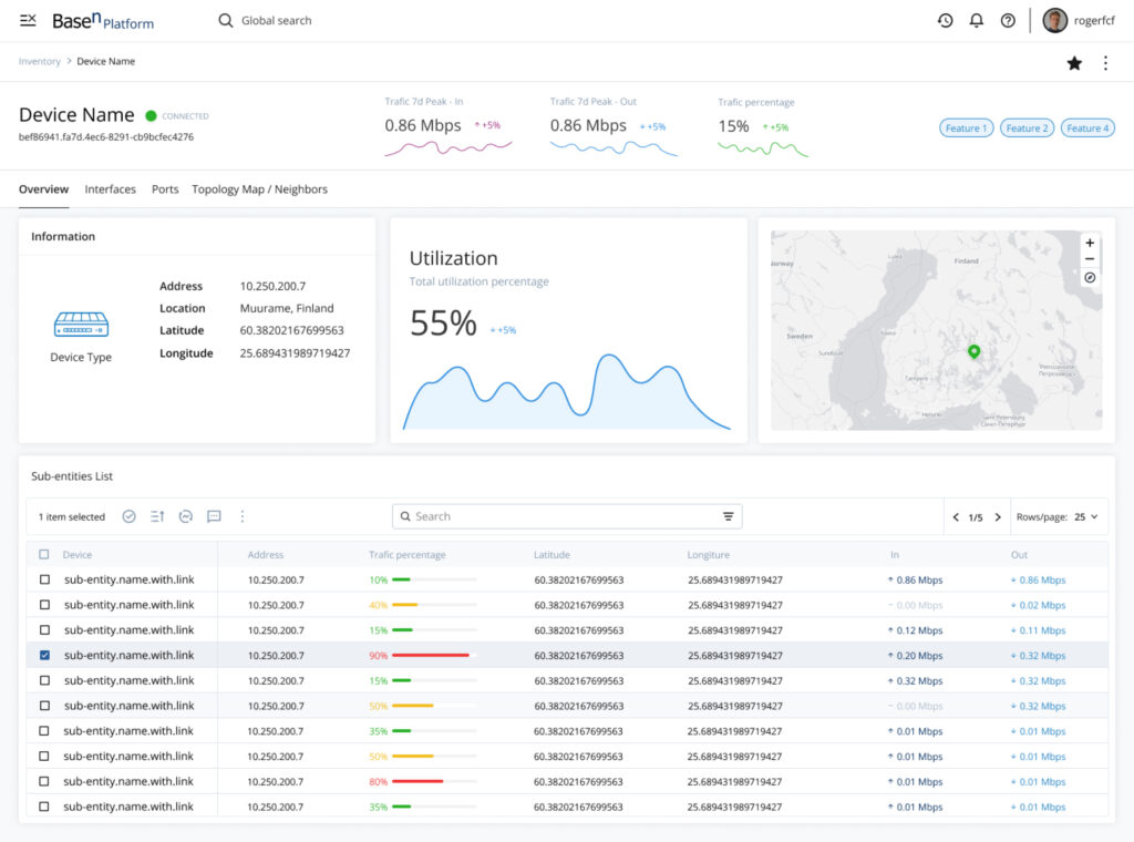
Sneak Peek at some delivered UIs

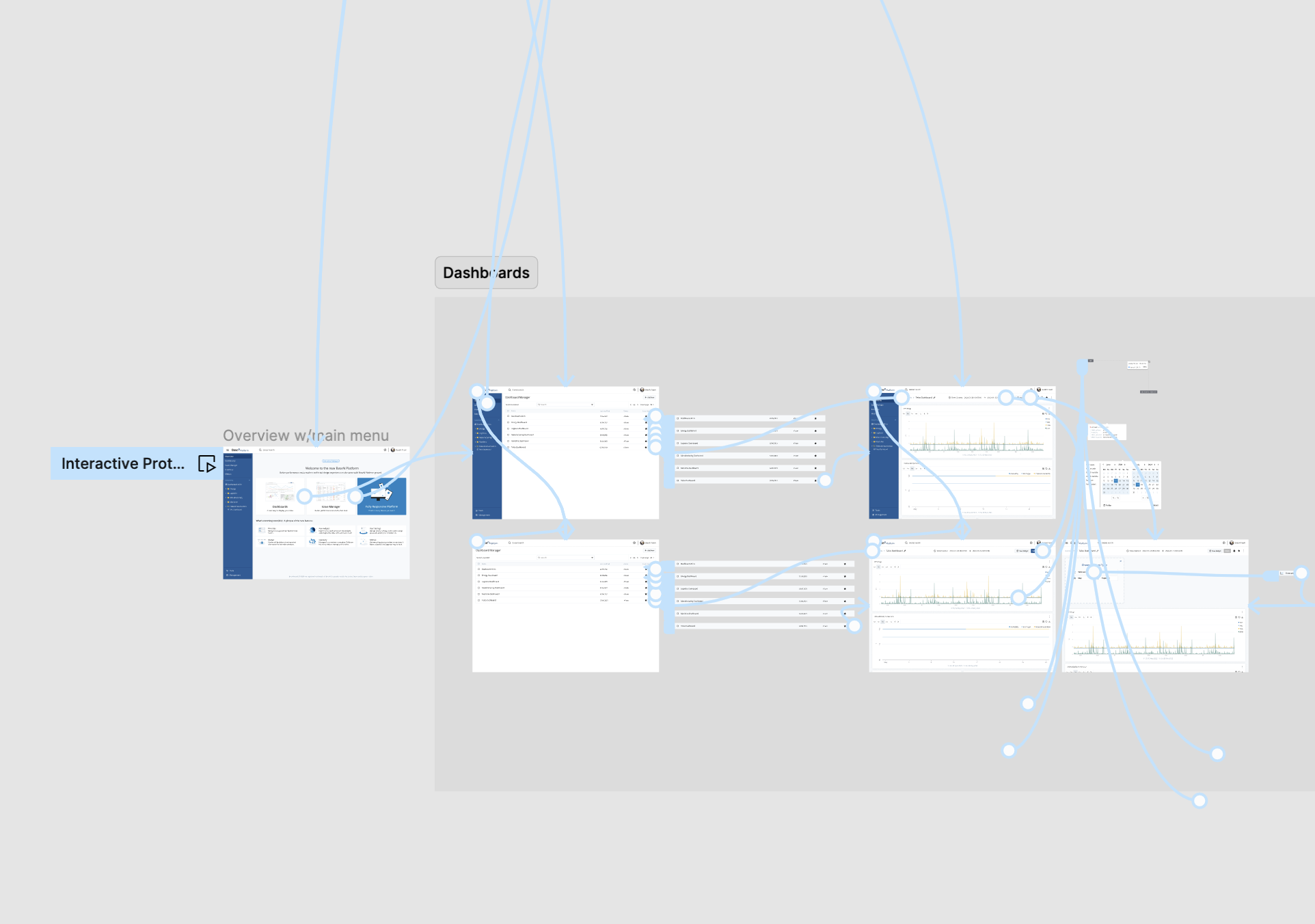
FINAL RESULT - USER FLOW

Thoughts & Takeaways

Final thoughts & Takeaways

People don’t like change unless you make it enticing and useful enough to cover their daily basis main pain points.
Solutions
Achievements